Hello Monday.
It’s the last week of the school year for my littles. Which elicits juxtaposition emotions for me. On the one hand I’m all over the notion of the end of early morning school runs and packing lunch boxes, on the other a tinge of sadness. They are both moving up a year at school, which means my babies are growing way too fast. I am simply unable to compute that my baby boy, baby used loosely here being that he is four , will be entering big boy school in September complete with uniform, school tie and blazer. How did that happen? My task for the summer holidays, besides keeping said littles entertained? Learning to tie a tie. It is a little crazy that I do not know, but there you are.
Moving on from my mommy issues, lets talk interiors.
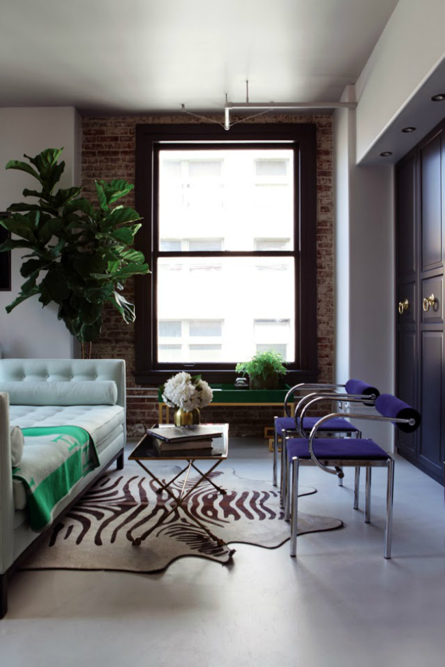
When I came across the images of this loft there were a few things which stood out to me. If you are one of those people, who like me, look at a space and not only see it’s beauty in the décor style but look for what makes that particular space work then you too will see how competently this space has been put together.
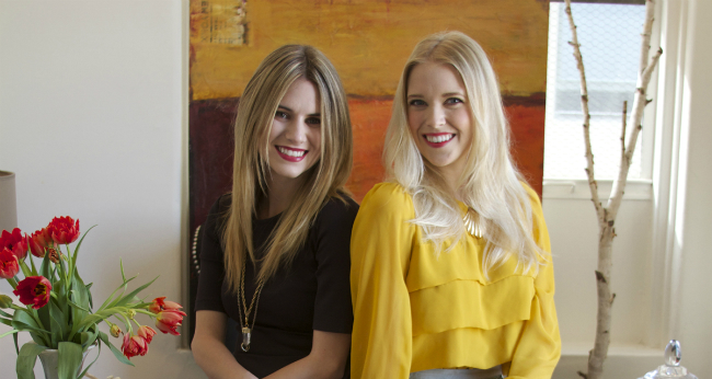
The apartment is owned and decorated by Caitlin McCarthy of the due design team Caitlin + Caitlin Design Co. The company, named after the two lovely ladies Caitlin McCarthy and Caitlin Murray who met on their very first day of interior design school. Sharing an almost identical design sensibility the duo vowed to one day launch a design business together. And for those clients whose homes they have decorated I am sure they are extremely glad they did just that.
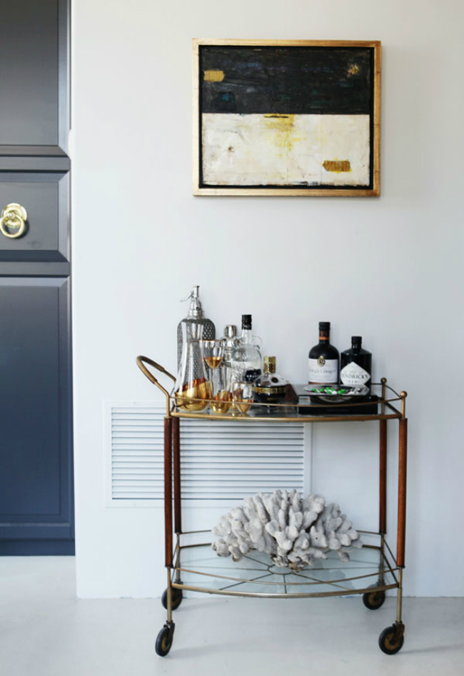
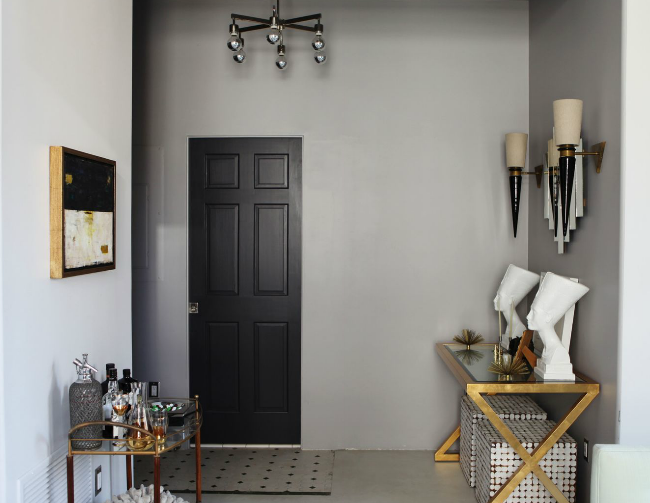
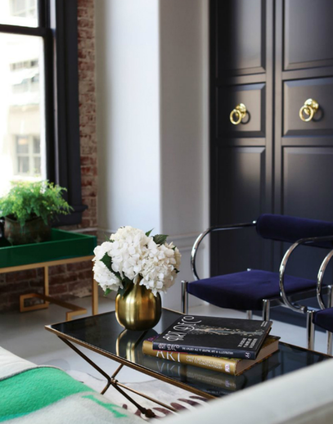
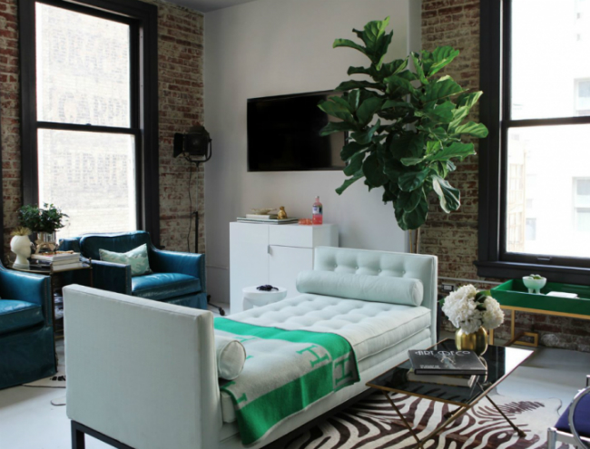
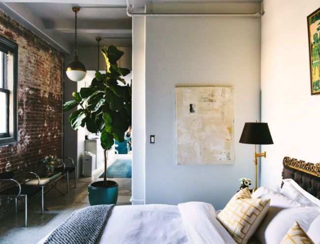
I came across these images of this apartment and was struck at how Caitlin had used a few simple tricks to put the space together. The apartment is fairly limited space wise. In that sense using continuity of a colour palette throughout makes the space cohesive and flow extremely well. Keeping the walls a light airy neutral and introducing colour on the dark window frames and navy doors in smart. Additionally leaving areas of the wall space with exposed brick adds a variance in colour and gives texture. Whilst adding a touch of earthiness and visual interest.
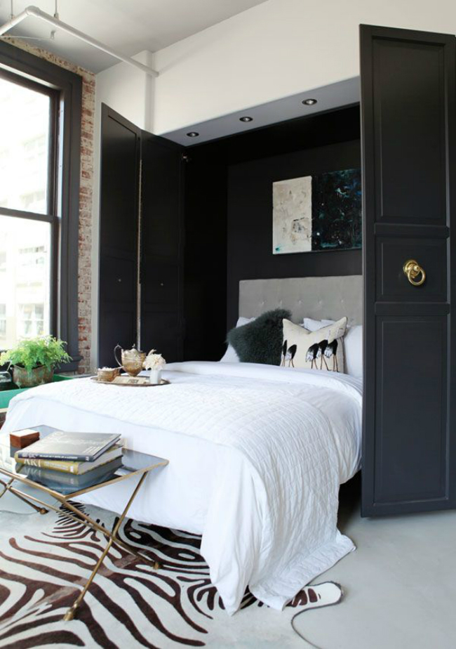
This apartment appeals to my sense of aesthetics mostly due to the fact that whilst the walls and floor are given a neutral shade Caitlin has made use of a few ballsy type hues. I am smitten with the navy doors with gold pulls.
The continuity of colour, neutrals, shades of blue and green are used throughout the apartment. Sticking to these colours but adding interest through variance of shade is the answer.
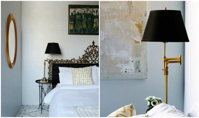
She has dressed the rooms exceptionally well. Not overly cluttered, being that the space is limited in terms of size. Again the colour palette of accessories has continuity. Giving the space a great flow.
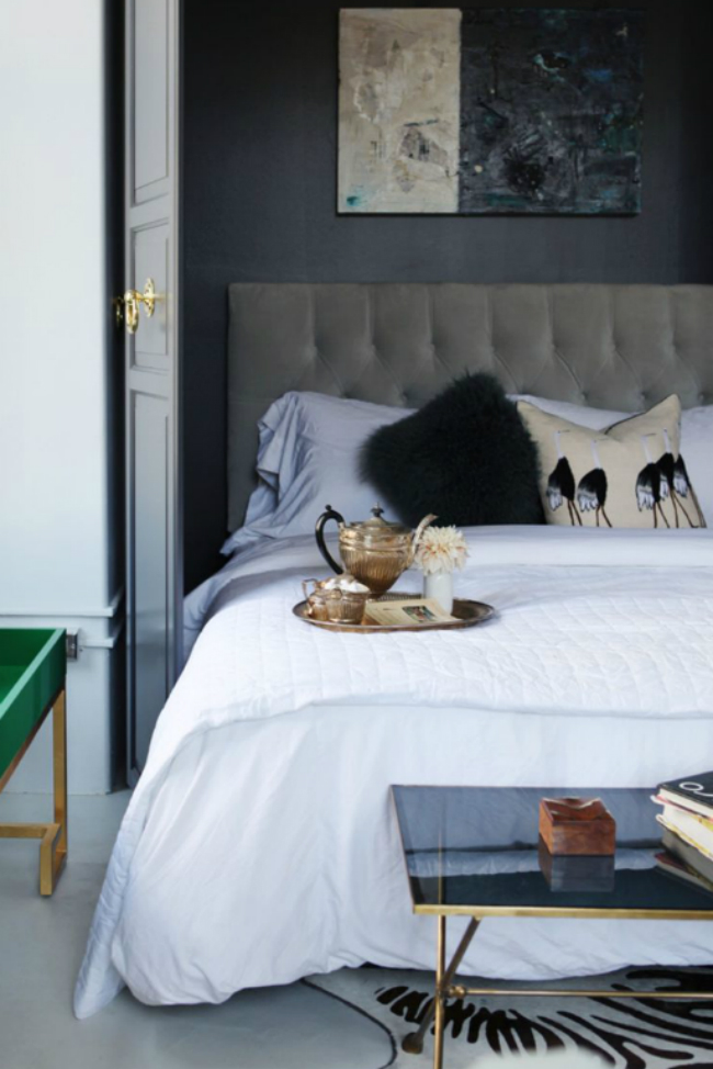
The moody accent wall in the bedroom is bang on, in short Caitlin nails it.
The bed dressed simply, allowing the simply swoon worthy headboard to take centre stage.
I am most certainly a fan of Caitlin’s décor aesthetic. I could move in to her apartment and not change a thing!
Have a fabulous week lovers.
Images: Caitlin and Caitlin











No comments