
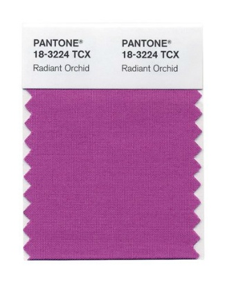
So, its out there. The Pantone colour of 2104. Radiant Orchid. It has to be said, and Im almost reticent to say it, because Im sure I will be made to eat my words when I am won over at some point, but for now. No, not loving.

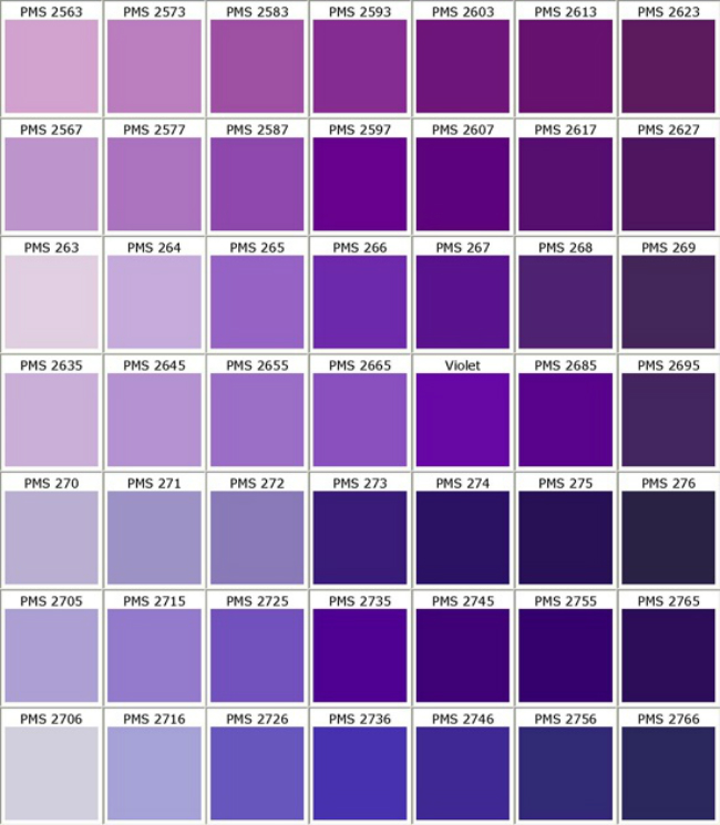
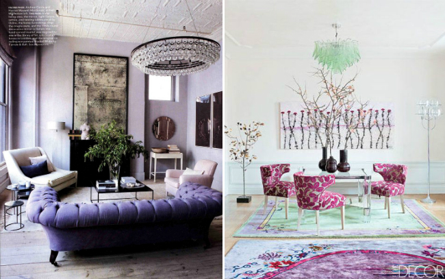
Purple. Not so sure. I like the richer, darker versions, like aubergine, am totes ok with that, but I await the wonders that will come in the next few months. Perhaps I will change my mind on the lighter versions. However its a big ask, because when I imagine the lighter shades of purple I think of some really nasty 80’s bridesmaids dresses complete with ruffles and taffeta. Not cool, not at all. However, I do concede that purple does blend well with neutrals and both silver and gold so it will be interesting to see how its used in the next year in interiors.
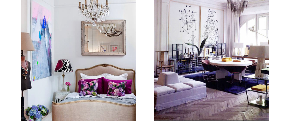
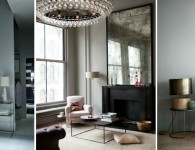
These rooms I think are beautiful, though, right?

There are so many variations of a colour, Im sure I will incorporate at least some over the next year!

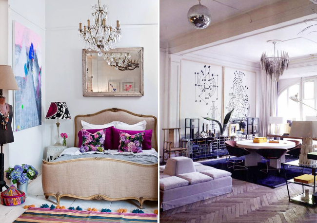
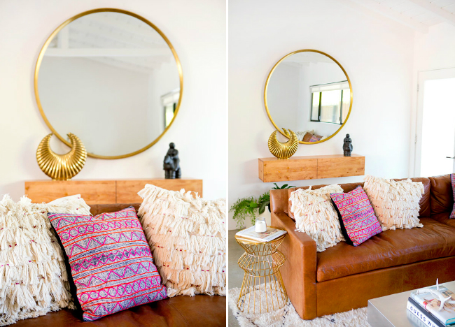
No need to go totally purple, touches will do! Like below.

So, its fair to say purple is not up there with my favourite colours but it can be pretty. Time will tell if I change my mind, always a posibilty.
Til next time.
![]()


No comments